Driving Digital Plan Participant Campaign
Background: New participants to a T. Rowe Price retirement plans were receiving sign-up packets in the mail that were extremely thick and full of documentation, which tended to be a bit overwhelming for users. This packet also included a 12-16 page T. Rowe Price brochure, full of information about the participants plan. This was a less than cost effective approach to onboarding new participants, and the company wanted to create a new way.
Problem Statement: The team goal was to streamline this brochure content into a more compact user experience, while also cutting costs for the T. Rowe Price Retirement Plan Services (RPS) group. This piece would also need to be tailored to the users 401(k) plan and their specific plan information to quickly find their plan essentials.
Target Audience: All newly transitioned participants in a T. Rowe Price 401(k) plan.
Strategy: To accomplish this our team needed to first test the original brochure content and ask questions that would help us consider what was the most important. We tested 10 users on usertesting.com and asked them a series of questions around the current state of the document, particularly what information would be most and least valuable to new participants in a 401(k) plan. Our audience ranged in age, from 22- 58, each owning their own personal 401(k) plan.
As our team heading into the project, we assumed that the current piece was too long, but we also didn’t feel that we could effectively condense 12-16 pages of information into roughly 4. Although, we knew that today’s user needs to have the most pertinent information available at their fingertips, if not, your product tends to not be effective or efficient for the user. We also assumed the user would want to see a quick overview of their plan that broke down the essentials in a 401(k), particularly the enrollment percentage and the employer match.
With this information our design and editorial team worked to develop a first draft 4-page document based on the initial feedback from the first 10 users. Once a solid draft was in place, our team conducted a second user test featuring the same demographics and specifications as the first test to see if there was any additional feedback that could be applied. We were surprised that there was such a positive response to our updated material and there wasn’t more user feedback to question our new content. While this set of testers wasn’t exposed to the original brochure format, they tended to prefer the work we had done overall. It was such a drastic change to design and structure; we were unsure of how they would receive our work.
Engagement:
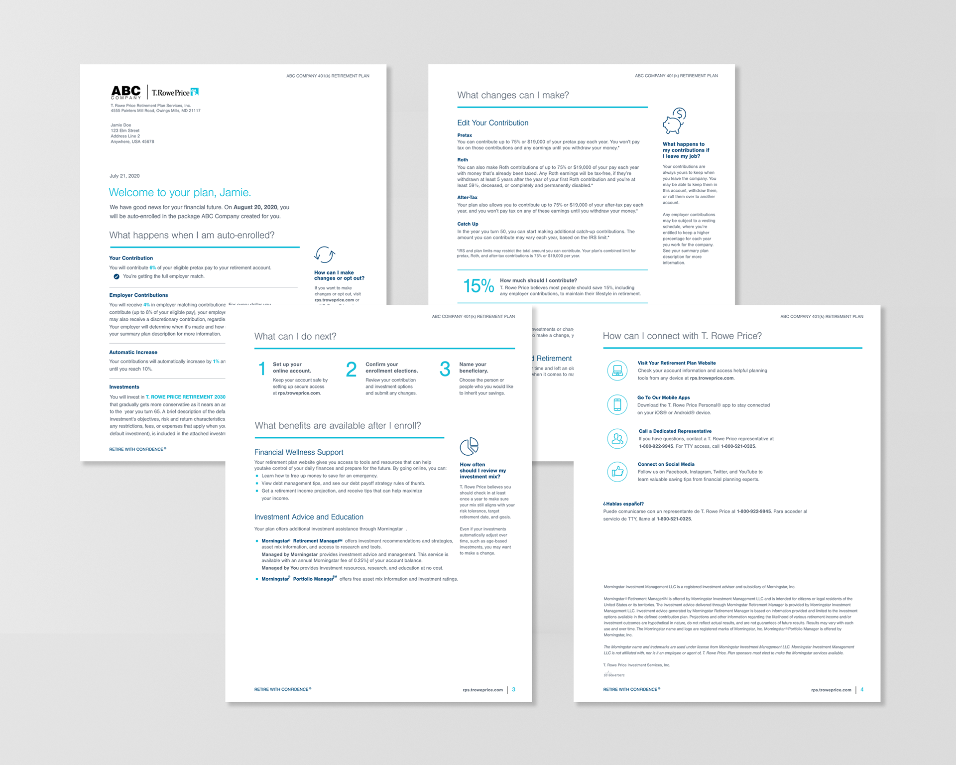
High Fidelity Designs from the Driving Digital Campaign
Results: Ultimately, the final piece was a 4-page document that condensed the user experience for participants, focusing on the elements that testers needed to see when being introduced to their new retirement plan. In this piece our team broke down 5 essential sections for users: Plan Overview, Plan Contributions, Next Steps, Plan Benefits, and T. Rowe Price Contact Information. Along with the newly developed condensed material we were able cut the RPS budget costs for the preparation of new plan participant documents by 40%.
